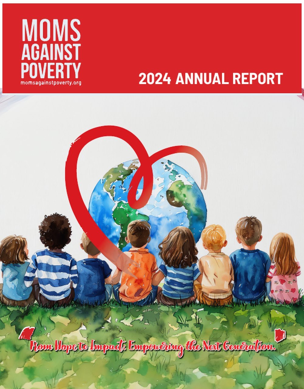
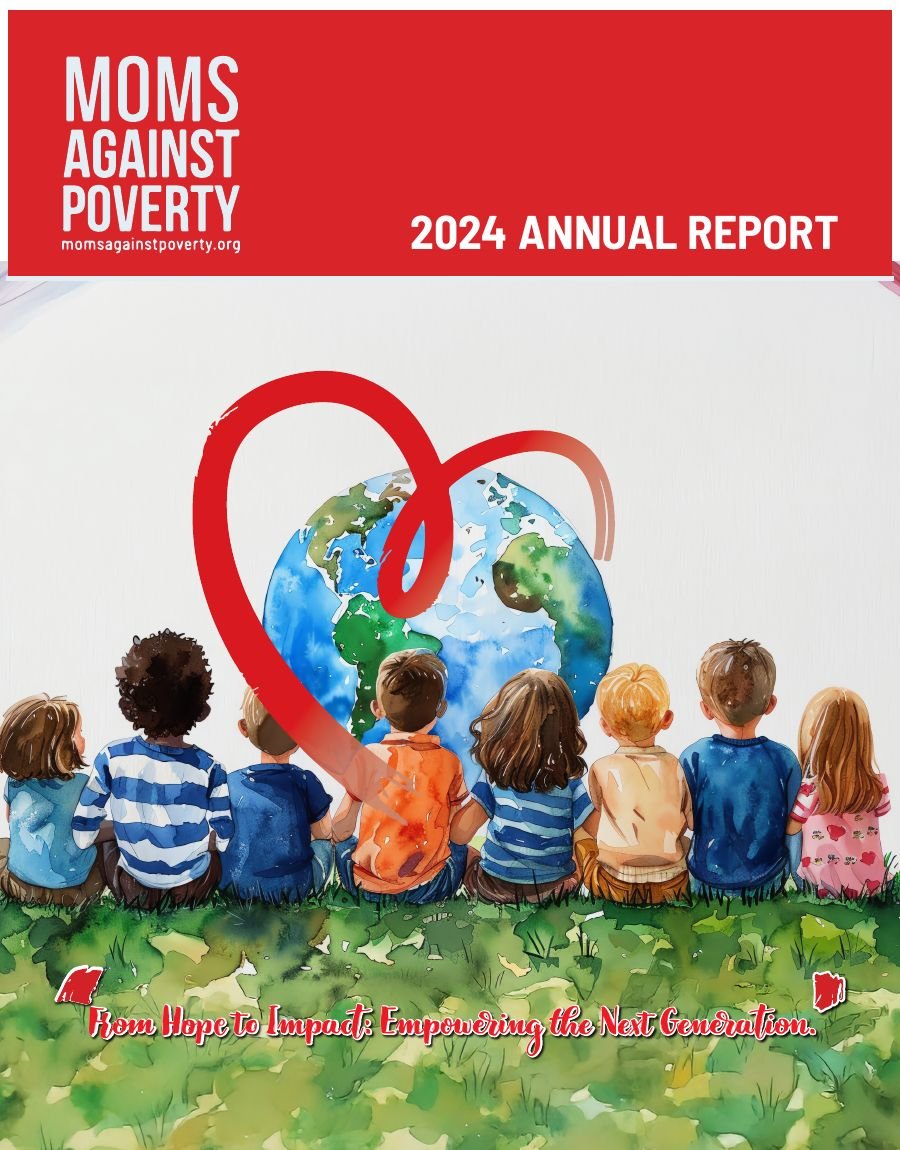
Cover — New Ways to Inspire & Empower the Next Generation.
Editorial design · 32-page annual report · 2024
A global children's charity working across five countries, reporting on a year in which it reached its five-millionth child. Thirty-two pages that had to satisfy auditors and move donors at the same time.
Cover — New Ways to Inspire & Empower the Next Generation.
The organisation
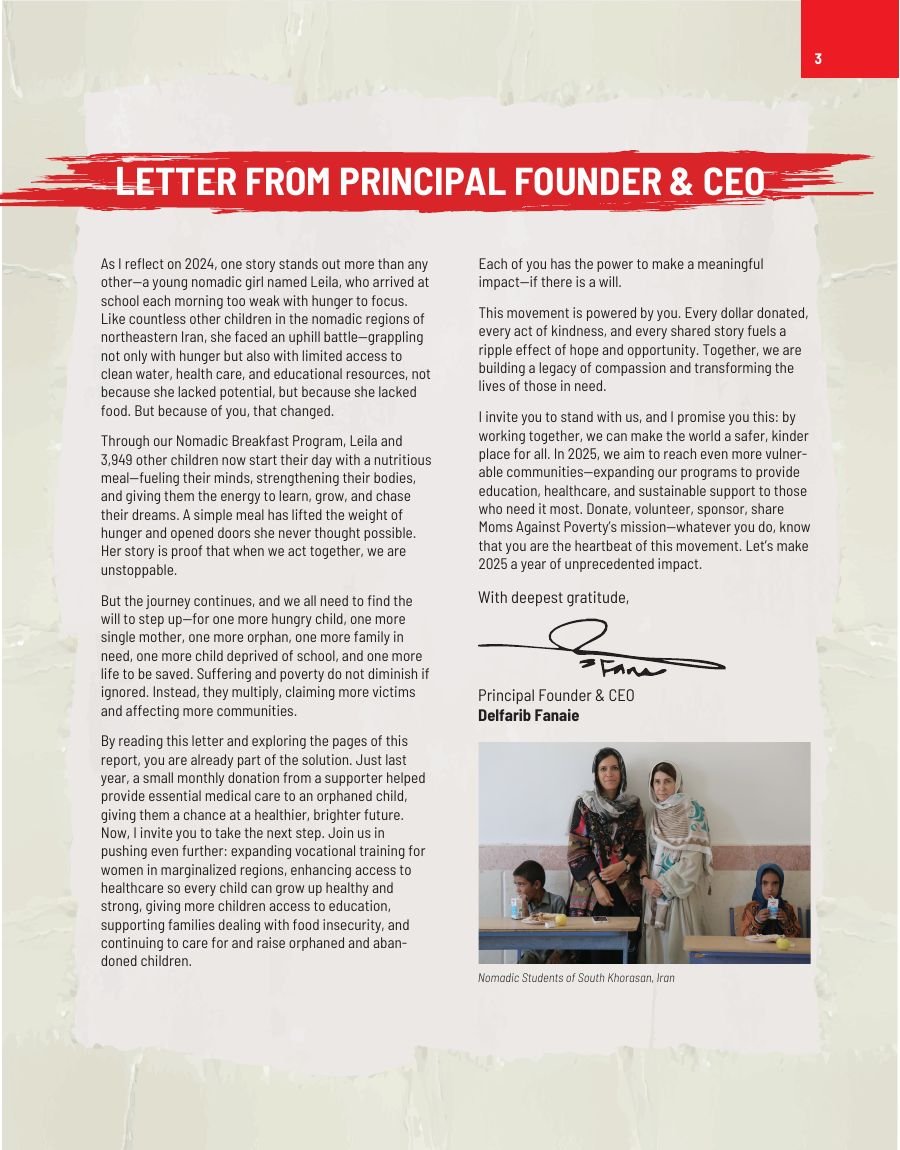
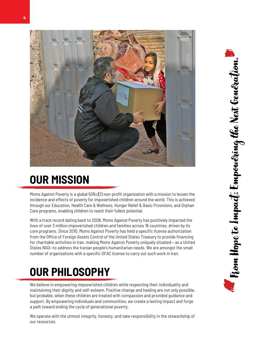
Moms Against Poverty is a global non-profit working to reduce the incidence and effects of poverty for children, through four core programmes: Education, Health Care & Wellness, Hunger Relief & Basic Provisions, and Orphan Care.
Since 2008 it has reached over 2.8 million children and families across 18 countries. It also holds a specific licence from the U.S. Treasury's Office of Foreign Assets Control to fund charitable work in Iran — one of a small number of American NGOs able to operate there legally.
That detail mattered to the design. A report covering Iran, Gaza, Senegal, the Philippines and the United States in one document has to move between very different contexts without the tone lurching.
2024 in figures
Headline figures carried on the global impact spread.
The problem
An annual report is read by two groups who want opposite things. Boards, auditors and institutional funders want verifiable numbers — revenue, functional expenses, programme allocation. Individual donors want to know a specific child is better off.
Give the first group what they want and you produce a financial statement nobody finishes. Give the second group what they want and you lose the credibility that unlocks major gifts.
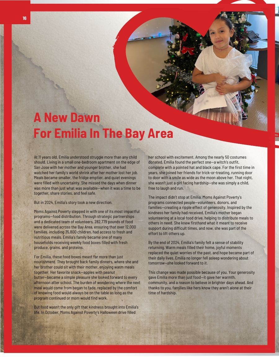
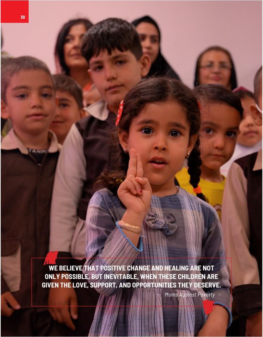
The structure resolves this by alternating rather than blending. Country sections open with a full-bleed portrait, then hand over to programme data, then close with one named story — Maryam in Iran, Emilia in the Bay Area, Ibrahima in Senegal. The reader is never asked to absorb statistics and empathy in the same breath.
Numbers earn trust. Stories earn the gift. The layout keeps them in the same book without letting either dilute the other.

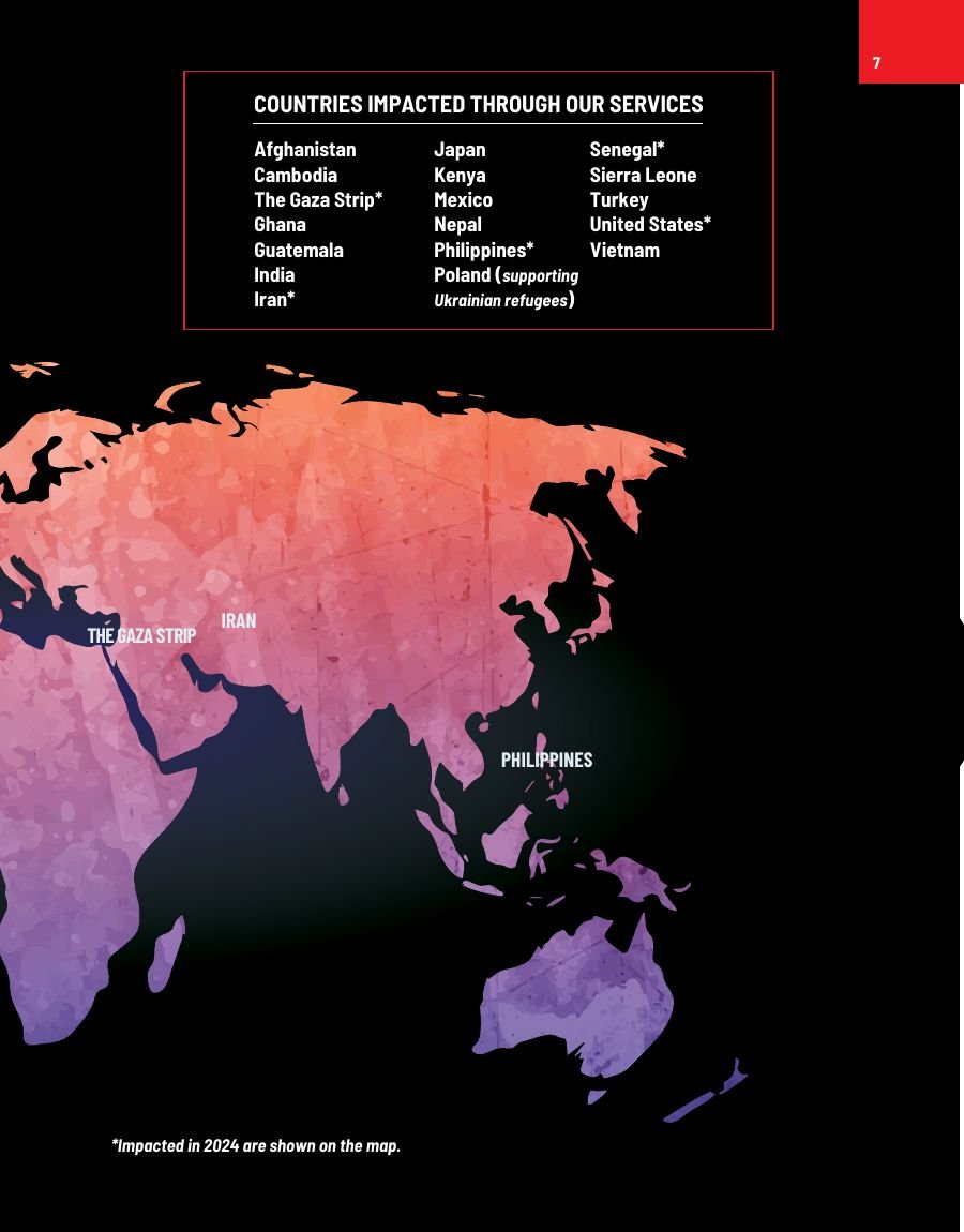
Global reach — five million lives since 2008, mapped against the 18 countries served.
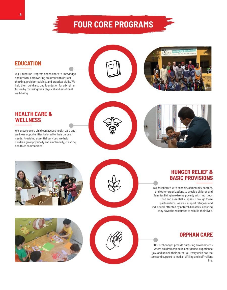
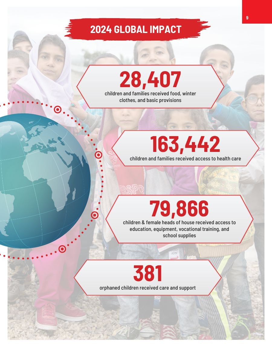
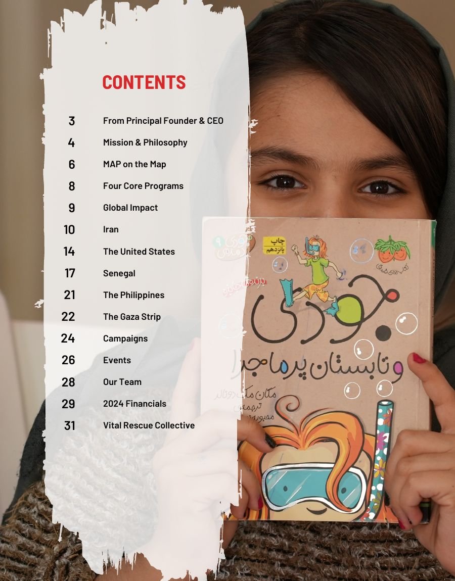
The four core programmes, then the year's headline figures.
Structure
The body of the report is organised geographically. Each country gets a cover portrait, spreads breaking results down by programme, and a personal story:
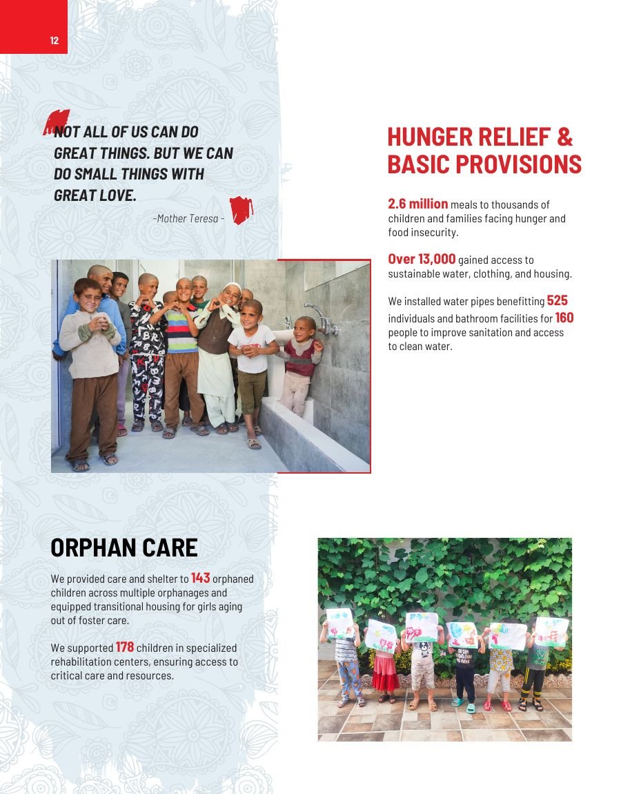
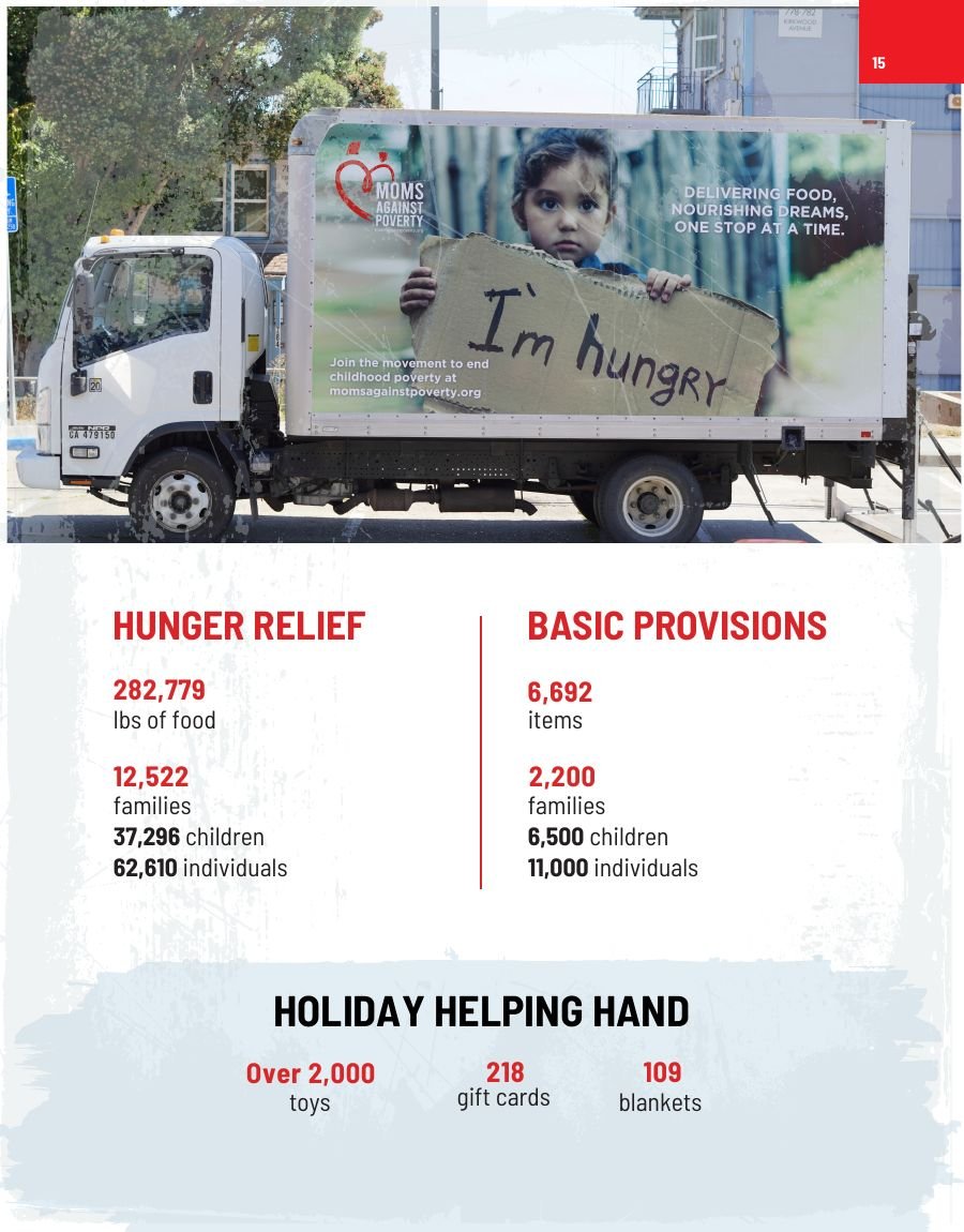
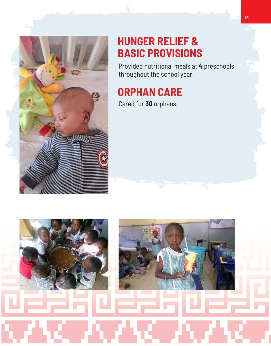
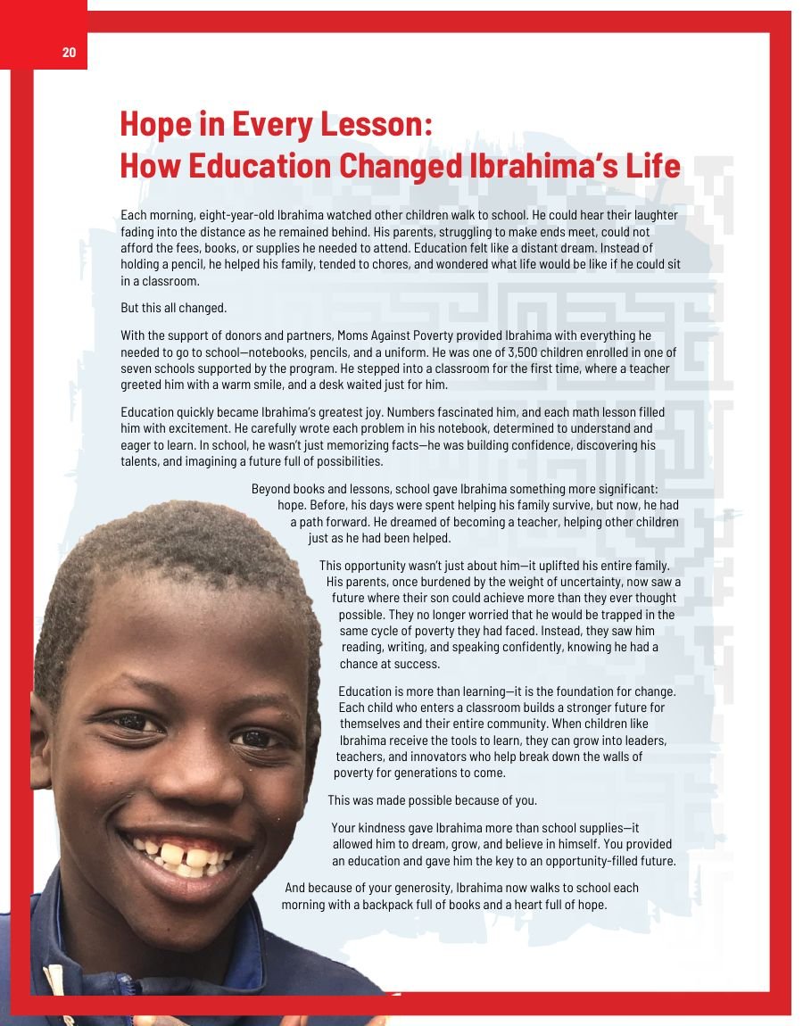
Iran — education, health care, hunger relief and orphan care, closing with Maryam's Journey: A Future Woven with Hope. United States — hunger relief, basic provisions and the Holiday Helping Hand, closing with A New Dawn for Emilia in the Bay Area. Senegal — health, education and orphan care, closing with Hope in Every Lesson: How Education Changed Ibrahima's Life. The Philippines — orphan care. The Gaza Strip — emergency relief.
Repeating the same internal rhythm in every country section means a reader who has understood one section can navigate the rest without re-learning the layout.
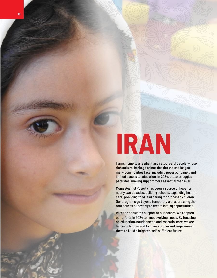
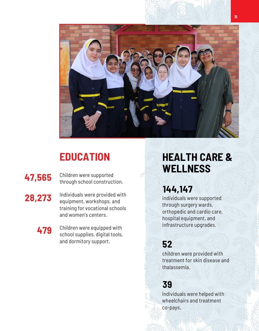
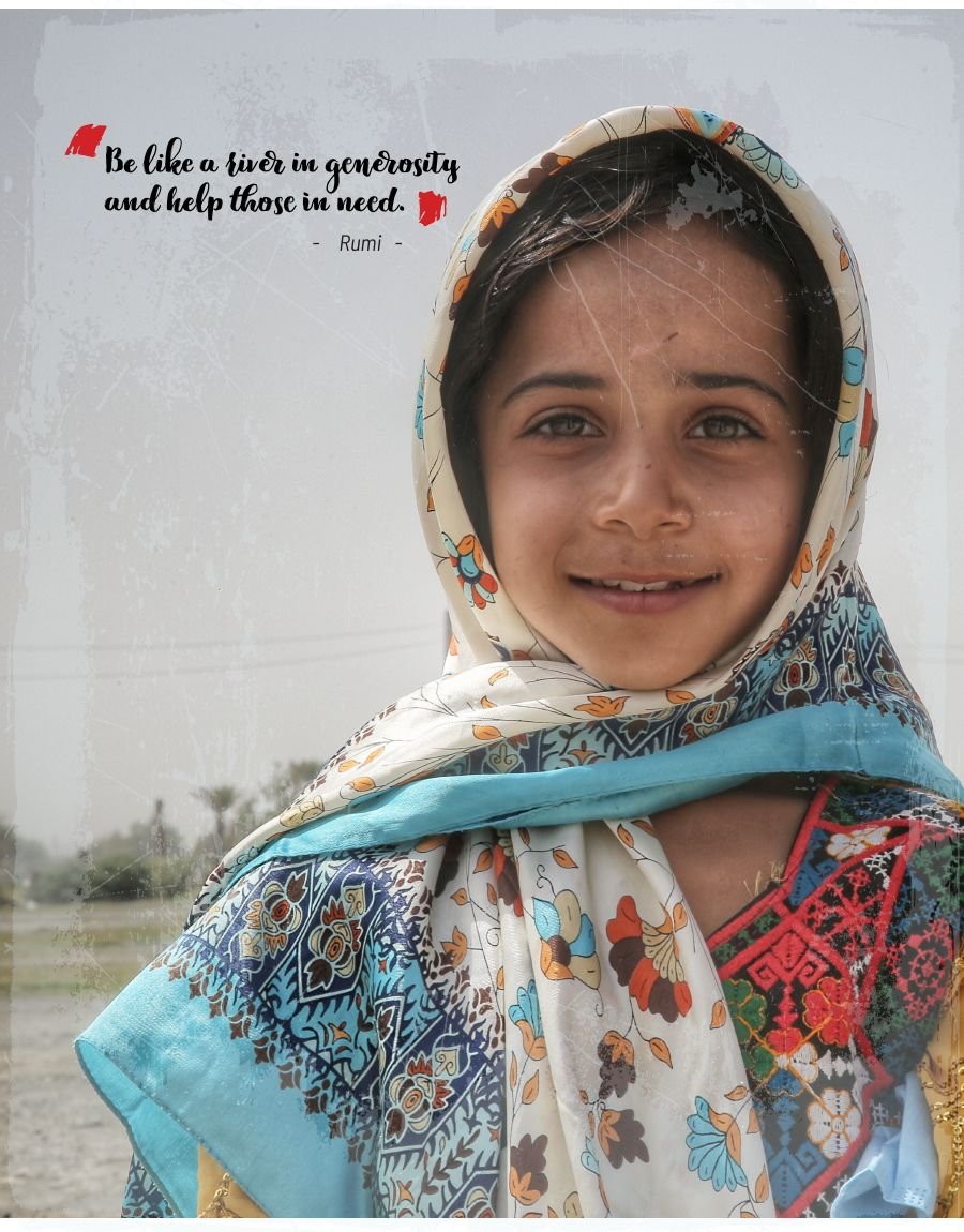
Iran opens on a portrait, then breaks results down by programme.
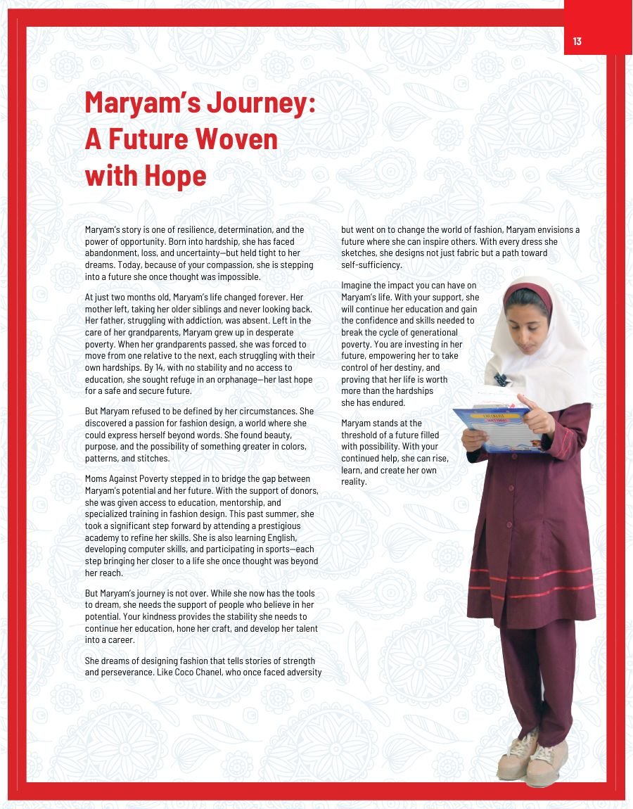
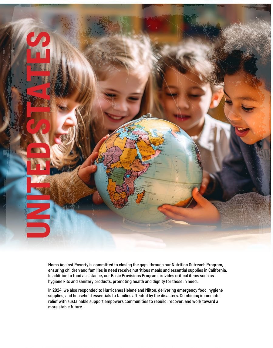
Maryam's story closes the Iran section; the United States opens the next.
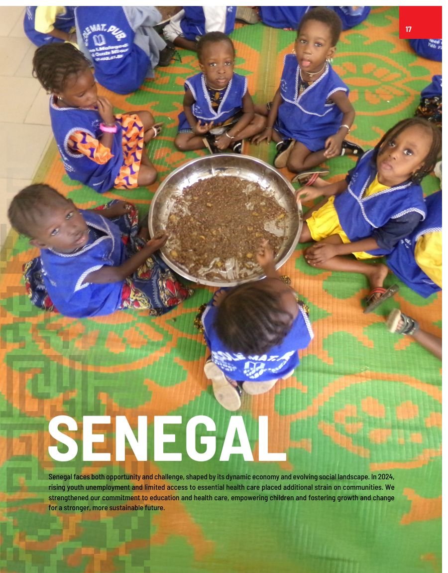
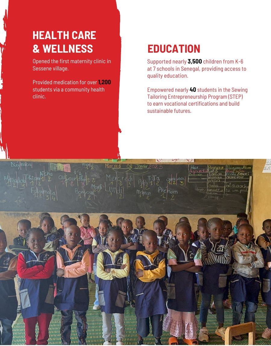
Senegal — the section rhythm repeats, so the reader already knows how to navigate it.
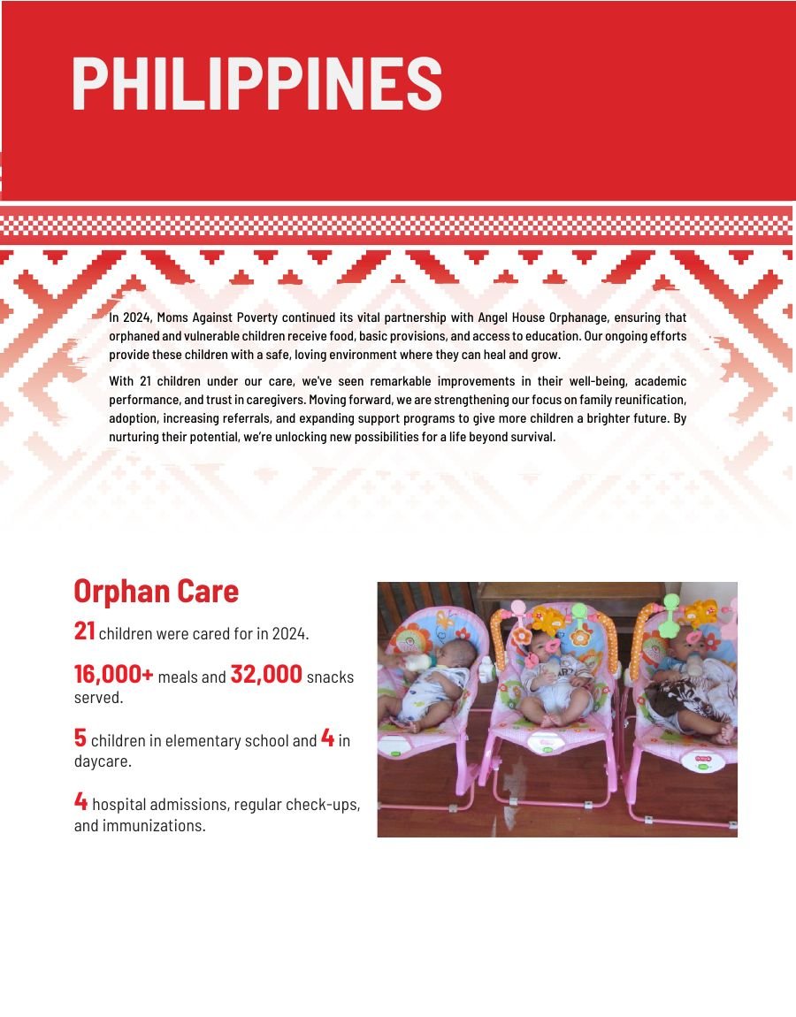
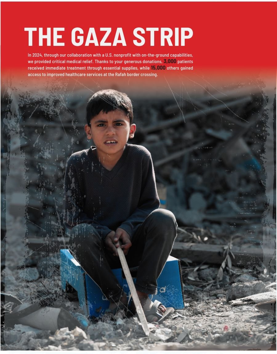
The Philippines and the Gaza Strip.
Handling difficult material
The Gaza section was the hardest page in the document. Photography from an active conflict sits badly next to fundraising language, and the wrong treatment turns suffering into marketing.
It's given a single image, minimal type and a lot of air. No pull quote, no statistic overlay, no call to action competing for the same space. The restraint is the design decision — the page trusts the reader rather than instructing them.
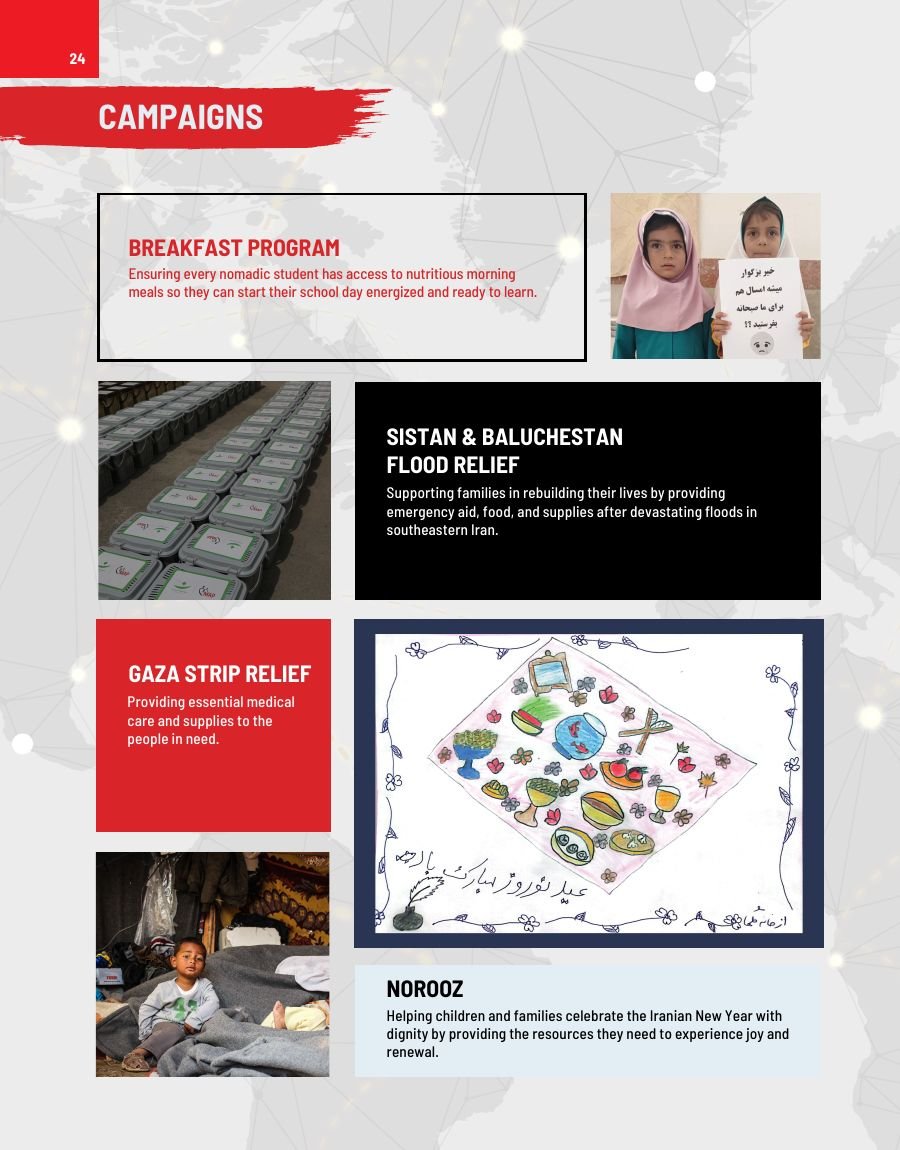
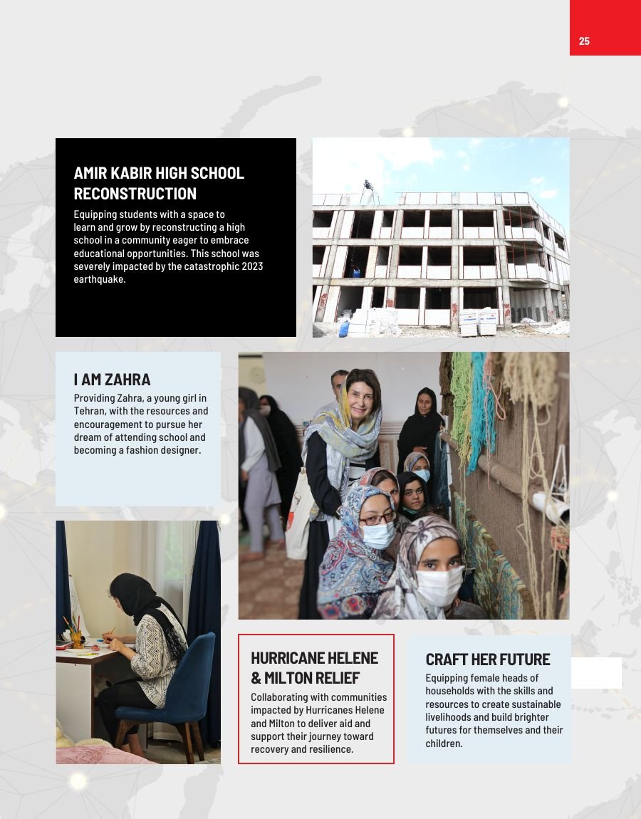
Campaigns — breakfast programmes, flood relief, school reconstruction, hurricane response.
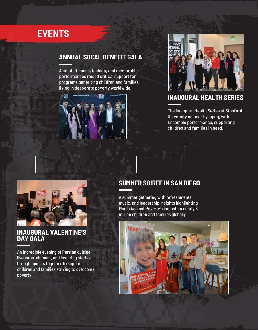
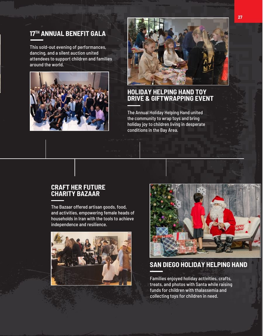
Events — the annual benefit gala, health series, charity bazaar and holiday drives.
Financials
The financial section had to present 2024 revenue and functional expenses clearly enough to satisfy scrutiny and quickly enough that a donor doesn't skip it.
Donut charts carry the revenue and expense splits, with figures called out at a size that survives at print scale. A ten-year total-asset trend line gives context a single year can't — it shows an organisation growing, which is the argument the numbers are there to make.
Board, finance committee, advisory committee and staff listings run opposite, set as dense structured type so the governance page reads as thorough rather than cramped.
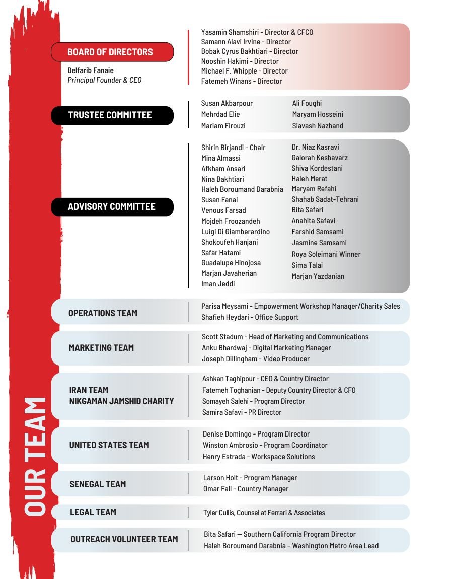
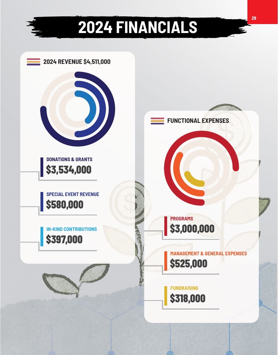
Governance listings opposite the 2024 financials.
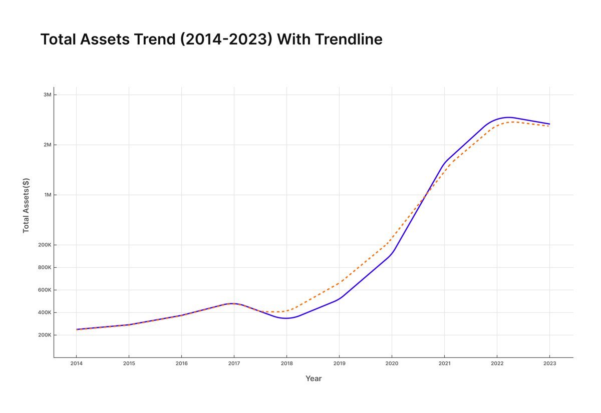
Ten-year total-asset trend with trendline — context a single year can't give.
Production
The file on record is the eleventh draft. That isn't indecision — it's how documents like this are made. Financial figures aren't final until audit closes. Programme numbers arrive from five country teams on different schedules. Photography needs consent clearance. Board listings change between drafts.
So the layout had to be built to absorb change without collapsing: a consistent grid, styled paragraph and character sheets, and image frames that hold their proportion when the photograph inside them is swapped. Late copy changes reflow instead of forcing a redesign.
The final file was prepared for print — bleed, crop marks and colour handled at the production end, where I could check the proof against the press sheet rather than guessing at the screen.
Eleven drafts is not a warning sign. It's what it costs to publish numbers you're accountable for.
The full report
Click any page to open it full size.
Next project
Contact
Based in San Jose, working across brand, print and digital.