The logo: a stylised skyline and roofline locking into the A2Z letterform.
Brand applications · 2023–2026
A San Jose commercial and residential contractor. Four years of continuous work taking one identity across print, vehicles, apparel, signage and storefront glass.
The logo: a stylised skyline and roofline locking into the A2Z letterform.
The work
Construction brands live in unusually hostile places — the side of a truck in the sun, a lawn sign in the rain, a hoodie that gets washed weekly, a storefront window seen at 40 mph. Each surface has different colour behaviour and different minimum legible sizes.
The through-line across four years has been keeping the mark consistent while re-engineering it for each substrate: foil on business cards, screen printing and embroidery on garments, contour-cut vinyl on glass, wide-format on banners and magnets.
A logo that only works on screen isn't finished. It has to survive vinyl, thread and foil.
Business cards with foil detail, stickers, letterhead. The card carries the contractor's licence number and a scripture line the owner asked to keep — a small thing, but the kind of detail that makes a card feel like the business it came from.
Truck wraps and decals for both white and black fleet vehicles, 24 × 18 in and 30 × 24 in magnets, 4 × 8 ft banners and lawn signs. Sized so the phone number stays readable from a passing lane.
Hoodies, tees, polos and caps across multiple runs — each spec'd by garment code, print method, placement and size breakdown. Front chest at 3.5 in, back at 11 in, cap front at 2.5 in.
Circle window decals installed on the company's retail frontage, contour-cut and positioned for visibility from the street.
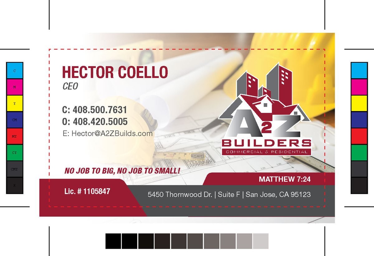
Business card proof with foil mask and registration marks.

4 × 8 ft outdoor banner.

30 × 24 in vehicle magnet
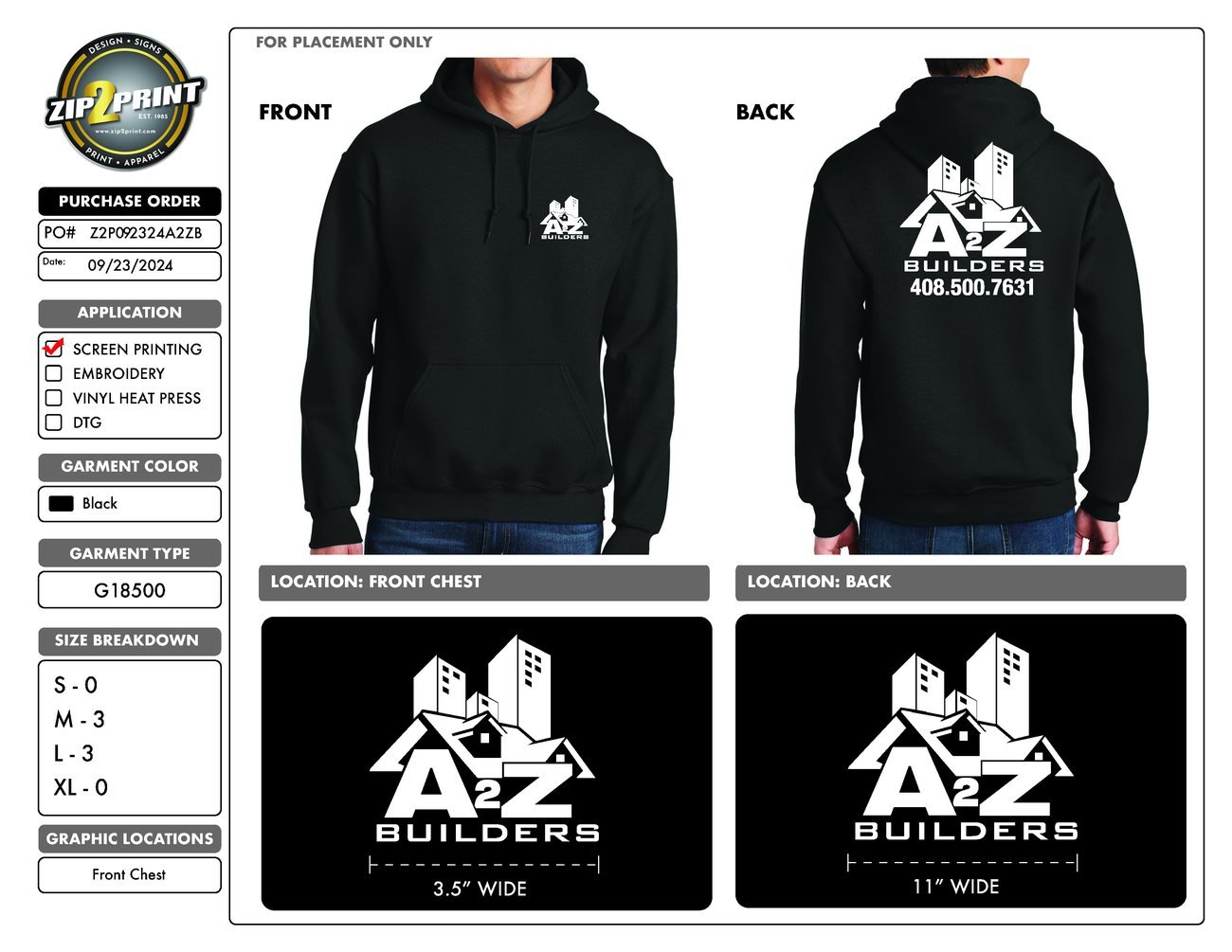
Screen-print proof — front chest and full back
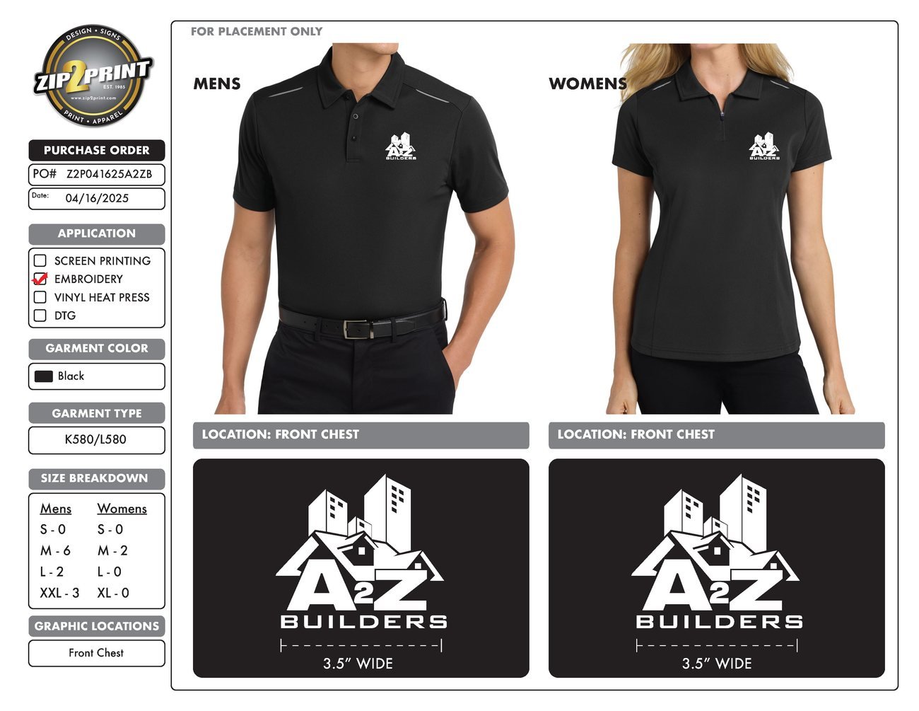
Embroidered polo, men's and women's cuts
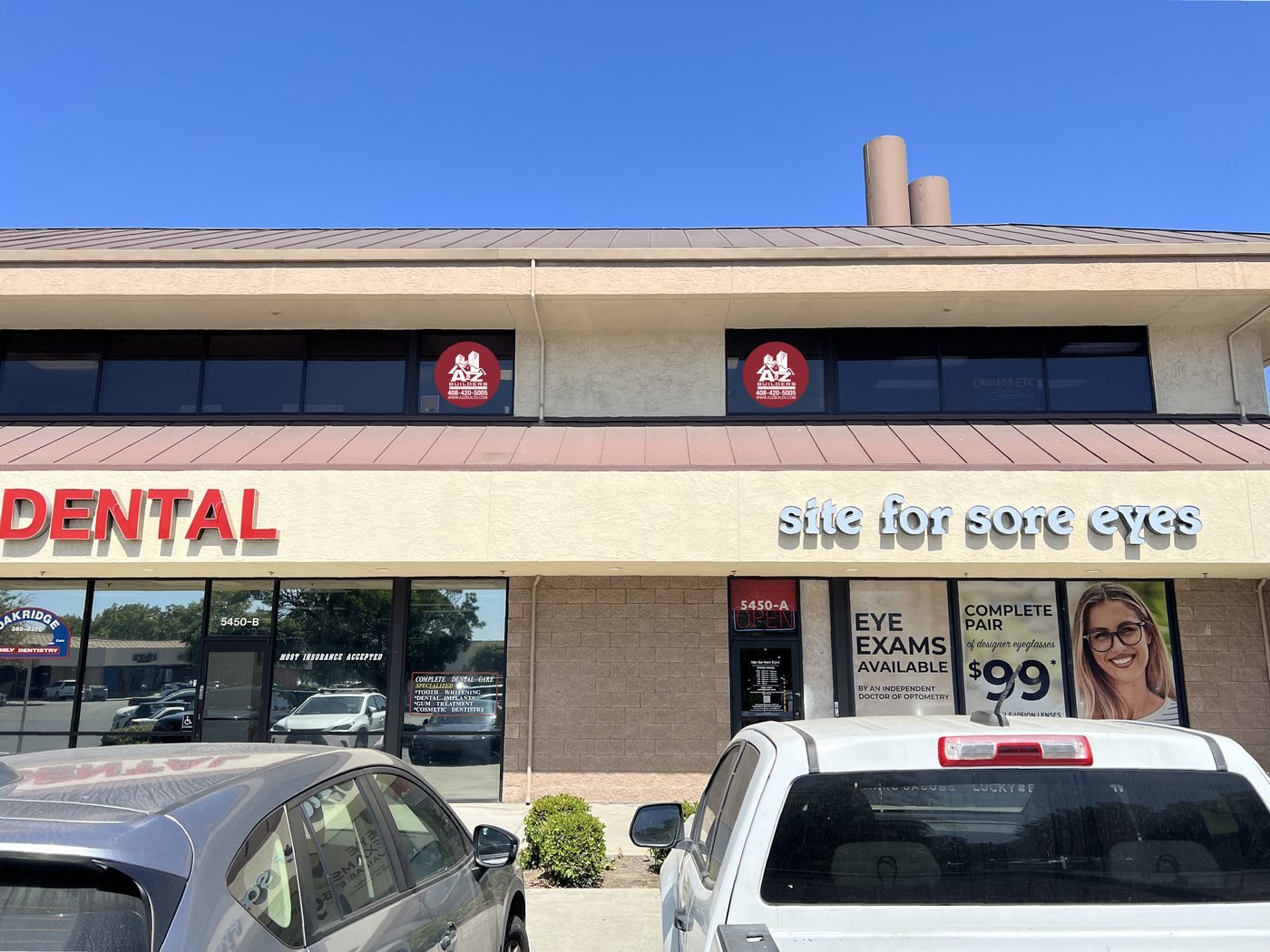
Contour-cut window decals installed on the storefront.
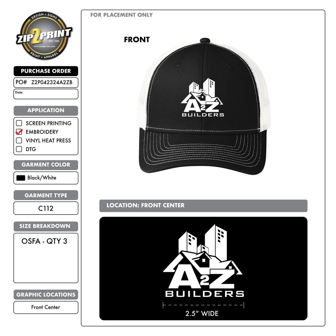
Embroidered cap, 2.5 in front centre.
Next project
Contact
Based in San Jose, working across brand, print and digital.